Google Flow
- 3.8
- Rating
- 10.00M
- Installs
- Free
- Price

 Analysis by App-foxy
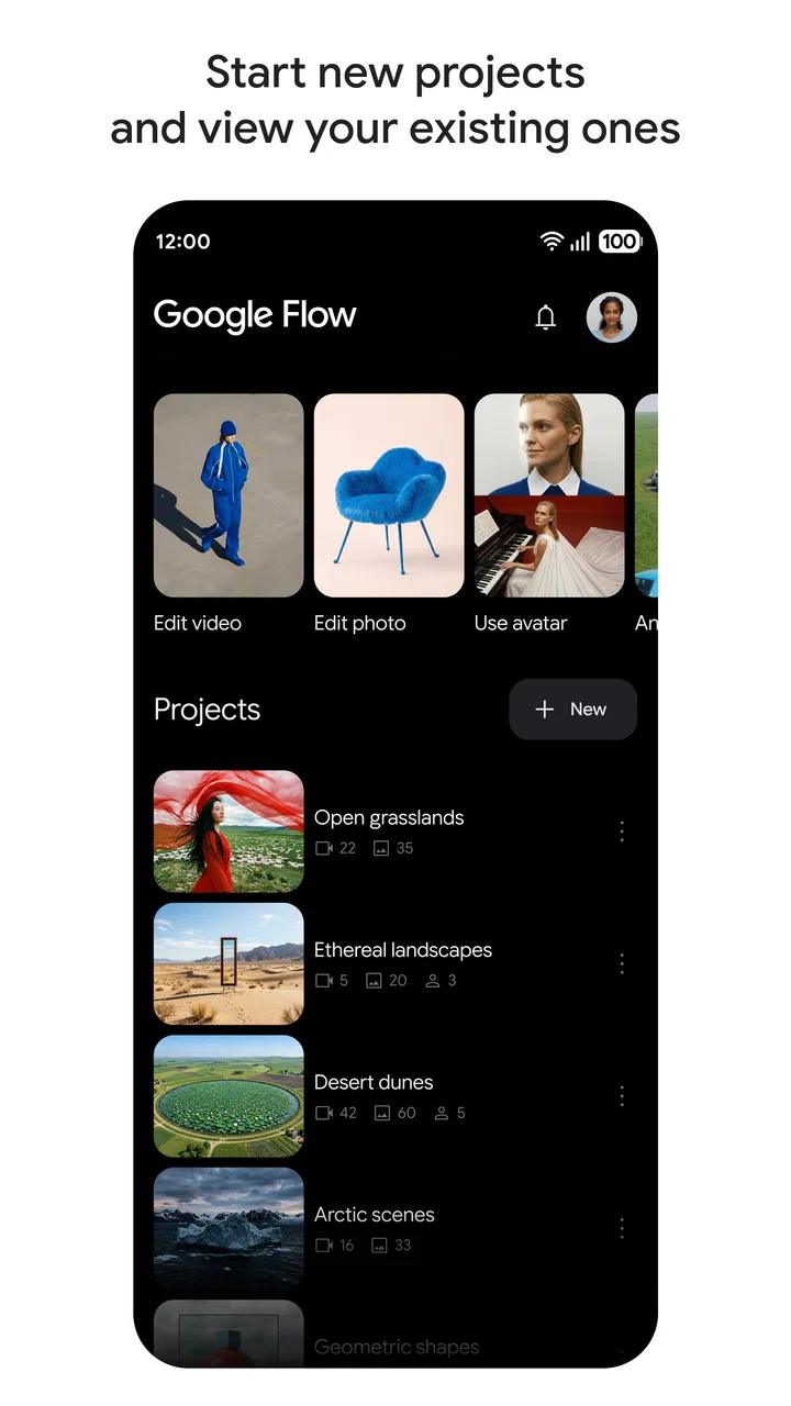
I approached Google Flow Beta as someone looking for a creative tool that could help turn a rough idea into something visual without starting from a blank canvas. It sits in the Art & Design space, comes from Google Labs, and is presented as an AI creative studio. That description is brief, but it points to the main appeal: this is less about traditional drawing technique and more about exploring visual ideas through guided experimentation.
My first impression is that it makes the most sense for people who think in concepts, references, moods, and quick variations. If you have a scene in mind but do not know how to build it manually, the app gives you a more approachable starting point. I would not treat it as a replacement for a full illustration suite, a professional layout program, or a carefully managed production pipeline. Its value is in helping you move from “I have an idea” to “I can see a direction.”
What to expect before creating anything
The app is free, which makes it easy to test without committing to a subscription. It is listed for a Teen audience, so I would still approach its creative output with normal judgment rather than assuming every generated result is suitable for every situation. The current release is version 1.447.0, and it supports devices running Android 7.0 or later.
You May Also Like

 Pandora - Music & Podcasts
Pandora’s Music Is Easy to Start, but Harder to Recover
Pandora’s strength is its low-effort path from a seed to a station. Its weak spot is how much confidence it asks you to place in connection, setup, and quiet recovery.

 8 Ball Pool
 Is Built on Rivalries, Rematches, and Routine
A close look at the rivalries, rematches, shared routines, and unanswered safety questions that turn a quick pool match into a persistent mobile community.

 Samsung Music
’s Quiet Strength Is Playing What You Already Own
Its reach comes less from spectacle than from dependable access to a personal library. That simplicity is both the app’s strongest retention engine and its ceiling.

 AccuWeather: Weather Radar
AccuWeather Review: A Quick, Clear Forecast for Everyday Decisions
For everyday plans, the best forecast is the one you can understand quickly. AccuWeather makes rain timing, radar, and local conditions easy to act on, with a few trade-offs.

 Hill Climb Racing
Why Hill Climb Racing Still Turns Crashes Into One More Run
A tiny car, a bumpy hill and one more upgrade: Hill Climb Racing keeps resurfacing because its simple chaos makes every near-miss feel personal.

 AliExpress - Shopping App
AliExpress Makes Global Shopping Feel Personal, but Shoppers Bear the Risk
AliExpress turns a global marketplace into a pocket-sized discovery engine. Its reach is useful, its shopping loop compelling, and its trade-offs easy to miss.
More From Our News Desk
View All News


Its public reception is reasonably mixed rather than universally enthusiastic. Google Flow Beta has an average rating of 3.7 from around 1.6 thousand ratings, alongside over a million installs. I read that as a sign that the idea is attracting real interest, while the experience may depend heavily on what a person expects from an AI design app and how smoothly it fits their particular workflow.
That distinction matters. Someone expecting a polished, conventional drawing program could feel lost, especially if they prefer visible brushes, layers, rulers, and precise controls. Someone who wants to brainstorm poster concepts, visual references, fictional settings, or a starting point for a personal project may find the looser approach much more useful.
I also recommend deciding what you want before opening it. “Make something cool” is usually too vague to produce a useful first session. A small goal works better: develop a color direction for a room, explore a character mood, create a visual reference for a story, or compare several compositions for a social post. The clearer the purpose, the easier it is to judge whether the result is helping.
Who is likely to enjoy it
I think the strongest audience includes beginners, writers, students, mood-board builders, hobby artists, and anyone who needs visual prompts quickly. It can also help a designer who is stuck at the idea stage and wants to explore possibilities before opening a more demanding tool. In that role, the app is a sketchbook for directions rather than the final workshop.
It is less suitable for a person who needs exact brand colors, dependable typography, repeatable production results, or detailed manual control over every mark. If your work depends on editable vector paths, carefully organized layers, or pixel-level retouching, a conventional design application remains the better choice. I would use this app to discover an approach, then move to a specialist tool when precision becomes the priority.
Getting through the first setup without overthinking it
For a first-time user, the best setup is not a complicated creative plan. I would begin with one modest objective and keep the first request narrow. Instead of describing an entire campaign, film, or illustrated book in one go, start with a single visual moment. This reduces confusion and makes it easier to tell which part of the result came from your idea and which part needs refinement.
Before creating, prepare a short description containing the subject, setting, mood, and visual direction. For example, I might describe a quiet reading corner in a small apartment, with warm afternoon light, muted green fabric, and a calm editorial feel. That gives the app several useful anchors without turning the instruction into a long paragraph that mixes unrelated goals.
A practical habit is to separate what must remain consistent from what can change. The room and time of day might be fixed, while the camera angle, materials, or color balance can vary. This makes experimentation more meaningful because each new attempt answers a specific question instead of producing another unrelated image.
I would also keep a simple record of the wording that led to a promising result. AI-assisted creative work can feel spontaneous, but the useful part is often the ability to return to a direction and adjust it. Saving the successful description outside the app gives you a reference when you want to recreate the mood or explain the concept to someone else.
The first setup is also a good time to lower your expectations about instant perfection. The most useful output may be an unexpected composition, a lighting idea, or a combination of colors you had not considered. That still counts as progress. I judge the first result by asking whether it gives me a better next question, not whether it is ready to publish.
How I would plan a first session
Choose one practical goal, such as a visual reference for a room, character, product concept, or story scene.
Write the subject, environment, mood, and style direction separately in your notes before combining them.
Make the first request simple enough that you can identify what needs changing.
Change one major element at a time instead of rewriting everything after every result.
Keep the strongest direction and use it as the foundation for the next experiment.
This method is more reassuring than trying to master every possibility immediately. It also protects your time. When an output misses the point, you can diagnose the problem: perhaps the subject was unclear, the mood was too broad, or the style reference competed with the main idea.
Finding the first meaningful success
For me, a successful first action would not be producing a masterpiece. It would be creating one visual that answers a real question. Suppose I am planning a small reading nook and cannot decide between a bright Scandinavian look and a darker, more cinematic atmosphere. I could use the app to explore those two directions, compare the emotional effect, and decide which one deserves more work.
That scenario shows where the tool can be genuinely useful in everyday life. A person redecorating a home, preparing a presentation, outlining a short story, or planning a handmade project may not need final artwork. They may simply need a visual conversation starter. Seeing an idea can reveal problems that were invisible in words, such as a crowded composition, an awkward color relationship, or a mood that does not match the intended audience.
One of my favorite ways to approach this kind of app is to ask for contrast rather than endless variety. Create a restrained version and an energetic version. Try a close viewpoint and a wide viewpoint. Compare a soft palette with a high-contrast one. The goal is not to collect random images; it is to learn which visual choices support the idea.
A less obvious benefit is that this process helps people describe their own taste. When I reject an output, I can usually explain why: the lighting feels too harsh, the scene is too busy, or the materials look too formal. Those observations become better creative instructions later. In that sense, the app can function as a feedback loop for your visual vocabulary.
Another useful workflow is to treat an early result as a brief for manual work. I might use the generated direction to decide on a layout, a prop list, a color family, or a reference image search. That is more realistic than expecting one result to serve as the finished asset. The app is strongest when it shortens the distance between imagination and planning.
Three habits that improve the results
Describe relationships, not just objects. Listing a chair, a window, a plant, and a desk may produce a collection of items, but explaining that the chair should be the visual focus while the window supplies soft side light gives the scene a clearer hierarchy.
Use deliberate variation. If you want alternatives, change one meaningful variable. Asking for a different mood while keeping the setting stable teaches you more than replacing the subject, location, and style at the same time. This is especially useful when you are choosing between directions for a real project.
Separate exploration from approval. A visually attractive result can still be wrong for the task. I would check whether the composition leaves room for text, whether the tone suits the intended viewer, and whether the main subject communicates the right idea. Beauty alone is not a reliable measure of usefulness.
These habits may sound simple, but they address a common problem with creative AI tools: people often judge the entire system after giving it an unfocused request. A more structured approach gives the app a fairer test and gives the user a clearer path when the first attempt misses.
Where first-time users may get confused
The biggest adjustment is understanding that an AI creative studio does not behave like a traditional canvas. In a drawing app, I can usually predict what a brush, selection, or transform control will do. With an AI-led workflow, the wording of the request becomes part of the control system, and the result may interpret the same idea differently than I intended.
That can make inconsistency feel like a fault, even when it is really a sign that the instruction contains too many open choices. If the result is close but not right, I would avoid immediately adding more adjectives. Instead, I would identify the single most important correction and state it plainly. “Keep the viewpoint, remove the extra objects, and make the subject larger” is more useful than adding a long list of new style references.
Another source of confusion is the difference between inspiration and deliverable artwork. A result can be excellent for brainstorming while still needing substantial adjustment before it belongs in a public project. I would be especially careful with work that represents a person, a business, or a specific product. Review the composition, wording, visual details, and overall suitability yourself.
It is also easy to spend too long chasing a perfect variation. I have found that creative tools become less helpful when every result triggers another tiny correction without a clear decision point. Set a stopping rule: choose the direction that best answers the original question, note what still needs manual work, and move on.
People may also wonder whether the app is enough on its own. My answer is usually no, and that is not necessarily a weakness. A focused design suite is better for final layout, while a drawing app is better for hand-made marks and controlled edits. Google Flow Beta makes more sense as an early-stage companion, particularly when the problem is uncertainty rather than execution.
If you are deciding whether to install it, ask yourself what kind of control you want. If you want to explore possibilities quickly, it is worth trying. If you already know exactly how every element should look and need dependable editing tools, you may become frustrated by the distance between an instruction and a precise final adjustment.
Handling creative uncertainty responsibly
I would keep a human review step in every serious workflow. Look for awkward details, unintended emphasis, and choices that do not fit the purpose. For personal brainstorming, this may take only a moment. For school, freelance, or professional work, the review should be more deliberate because a visually convincing result can still communicate the wrong thing.
The Teen content rating is another reason to use judgment when sharing results. I would not assume that an AI-generated visual is automatically appropriate for children, a classroom, a client, or a public feed simply because the app is easy to use. The final responsibility remains with the person choosing where and how to use the output.
Moving from experimentation to a useful workflow
Once the first session succeeds, I would give the app a defined role instead of using it for everything. For a writer, that role might be exploring settings and atmosphere before drafting. For a student, it might be testing presentation themes. For a home project, it might be comparing visual directions before buying materials. For a designer, it might be loosening up at the beginning of a project.
The trade-off is speed versus control. The app can help me reach several creative directions faster than building each one manually, but I give up some predictability in exchange. That is a good trade when I am still deciding what I want. It is a poor trade when I already have a precise specification and need faithful execution.
I would also avoid treating the first attractive result as the only valid answer. The strongest idea may appear in a less polished attempt because it contains the right composition or emotional tone. Save the concept, not just the prettiest surface. You can often improve a direction later in another tool, while a polished but unsuitable image may waste more time.
Google Labs is a fitting developer for this kind of experimental product, and the beta identity sets the right expectation: I see it as a place to explore an evolving creative workflow rather than a finished replacement for every established art application. That makes the experience more interesting for curious users, but it also means people who need a completely predictable process should be cautious.
After spending time with it, I would recommend Google Flow Beta to a friend who wants a low-pressure way to turn loose visual ideas into concrete directions. The free price removes the biggest barrier to trying it, and its presence in the Art & Design category reflects its real purpose: helping with visual thinking rather than simply offering another drawing surface.
My final advice is to install it with one question in mind. Do not ask it to solve an entire creative project immediately. Ask it to help you choose a mood, compare a composition, or see a possibility that words alone are not showing you. Its best result is often not the finished picture, but the clearer decision that comes after seeing the idea.
For beginners, that makes the first meaningful success fairly approachable. For experienced artists, it can be a useful spark, provided they keep their usual tools for precision and finishing. I would skip it if I needed exact manual control from the first stroke, but I would gladly return to it whenever I felt stuck at the starting line.
FAQs for Google Flow
01What is Google Flow Beta and what does it do?
Google Flow Beta is an innovative application designed to enhance productivity by integrating various Google services into a seamless workflow. It allows users to automate tasks, manage projects, and collaborate efficiently. The app is currently in beta, meaning it's still being tested and improved based on user feedback.
02Is Google Flow Beta available on both Android and iOS platforms?
Yes, Google Flow Beta is available for download on both Android and iOS platforms. Users can access it through the Google Play Store or the Apple App Store, ensuring a wide range of compatibility across devices. However, as a beta version, it may have limited features compared to the final release.
03Are there any costs associated with using Google Flow Beta?
As of now, Google Flow Beta is free to download and use. However, since it is a beta version, some features may be locked or limited, and future updates might introduce premium options. It's recommended to check the app's description on the store for any changes in pricing.
04What are some key features of Google Flow Beta?
Google Flow Beta offers a variety of features, including task automation, seamless integration with Google apps, and collaborative tools for team projects. It also provides customizable templates and real-time notifications to keep users updated. The app is designed to streamline workflows and improve efficiency.
05How can I provide feedback or report issues with Google Flow Beta?
Users can provide feedback or report issues directly through the app by accessing the 'Feedback' option in the settings menu. This feedback is crucial for developers to enhance the app and fix bugs. Alternatively, users can visit the official Google support page for more detailed assistance.
Pros
- Intuitive interface for easy navigation.
- Real-time collaboration features included.
- Seamless integration with Google Workspace.
- Customizable workflows to fit your needs.
- Supports a wide range of automation tasks.
Cons
- Limited functionality in beta phase.
- Occasional sync issues reported.
- Requires a Google account to access.
- Some features need internet connectivity.
- Lacks advanced analytics tools.

Google Flow
Gallery